Graphing Functions Using Maxima
1 Our Choice for Graphics
Maxima actually has *several* ways to produce graphs in 2 and 3 dimensions. It has a built-in command called
plot2d() [ in wxMaxima: wxplot2d() ] that produces 2d graphs in a fairly straightforward manner. The issue with this
is that this function can only graph curves that look like y = f(x). It cannot graph circles, parametrically defined curves,
draw line segments, plot points, or do most things that a Calculus student would eventually need to do.
That is why will will opt to use the very flexible "draw" library for our 2d graphing needs. It will be flexible enough to
cover all of our graphics needs for all of Calculus -- both single and multivariable! It is a little more verbose in its command
structure, but it's a fair trade for the flexibility and control that we will gain.
1.1 Loading the draw Library
To load the draw library, we simply type:
| (%i2) | load("draw")$ |
If this is the first time you've loaded draw, it may have to compile the library, meaning that all kinds of messages will flash
through the notebook. These messages can be safely ignored, and if you want to get rid of them, simply re-evaluate the
cell with the load("draw")$ command again. This will clear out all the cruft and you'll have a nice clean notebook.
2 A Note About Plain Maxima
If you are using plain Maxima in either the command line or xmaxima interpreter, then simply replacing wxdraw2d() with draw2d() everywhere in this section will allow the instruction to be valid to your situation. Even if you are using wxMaxima, if you use draw2d() and your system is properly configured, calling draw2d() will simply launch GnuPlot with your graph contained in an external window.
3 Basics by Examples: Explicit Graphs
3.1 Explicit vs Implicit
The draw library can graph functions defined *explicitly* like: y=x^2 and also *implicitly* like: x^2+y^2=1.
We will begin with the explicit type of functions.l
To plot a quick graph of a function we use the command: wxdraw2d() like so:
wxplot2d(explicit(f(x),x,xmin,xmax));
Here are several examples:
| --> | wxdraw2d(explicit(x^2,x,-2,2)); |
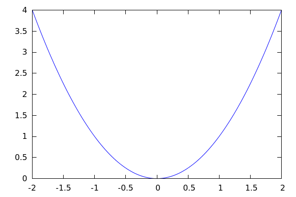
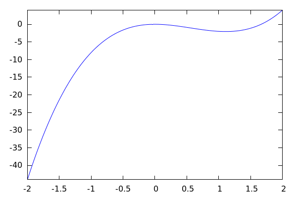
Note that we call wxdraw2d() and tell Maxima that the function is *explicitly* defined by x^2. We can also use a pre-defined function, as long as we use the correct syntax:
| --> |
f(x):=3*x^3 - 5*x^2; wxdraw2d(explicit(f(x),x,-2,2)); |
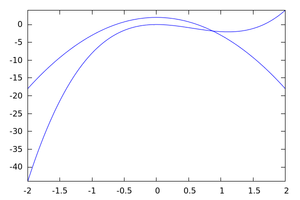
If you want to plot several functions on the same set of axes, each function gets its own explicit() label:
| --> |
wxdraw2d( explicit(f(x),x,-2,2), explicit(2-5*x^2,x,-2,2) ); |
This can indeed seem irritating at first, but it will make life infinitely easier later on if you have to plot, for example,
a function y=f(x), a parametric curve defined by (x(t),y(t)), and an ellipse x^2/a^2+y^2/b^2=1 all in the same
set of axes. So, just suffer the slight inconvenience for now.
3.2 Styling Graphs
3.2.1 Legends for Graphs of Multiple Functions
To get Maxima to include a legend, we use the key-color option like so:
| --> |
wxdraw2d( key="x^2",color=red, explicit(x^2,x,-2,2), key="3x^2",color=blue, explicit(3*x^2,x,-2,2), color=black,key="5x^2", explicit(5*x^2,x,-2,2) ); |
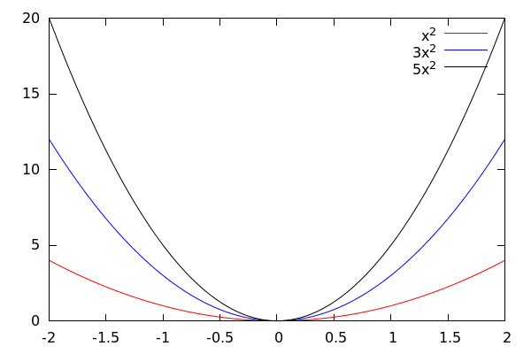
Notice that the order in which color and key come in does not matter, but it is important that they proceed the curve that they are labeling.
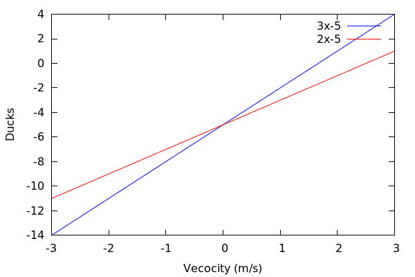
3.2.2 Axis Labels and keys
If you want to label the xy-axis in a particular way, we use the xlabel and ylabel commands:
| --> |
wxdraw2d( key="3x-5",color=blue, explicit(3*x-5,x,-3,3), key="2x-5",color=red, explicit(2*x-5,x,-3,3), xlabel="Vecocity (m/s)", ylabel="Ducks"); |
We will also set a title in the next example, and we will change the style of each curve as well as its color:
| --> |
h[v](t):=-16*t^2-v*t+50; /*We define all three height functions together to save space*/ wxdraw2d( key="Fast Throw",color=dark_green, explicit(h[32](t),t,0,3), key="Medium Throw",color=dark_red, explicit(h[20](t),t,0,3), key="Dropped",color=blue, explicit(h[0](t),t,0,3), xlabel="Time (t) in seconds", ylabel="Height in ft", title="Different Drop Models"); |
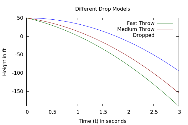
Notice how we exploit the fact that by hitting Enter, we just jump to the next line.
This way, we can put a different option for the graph on each line and keep the input
nice and manageable.
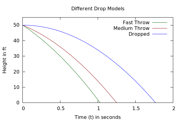
3.2.3 Limiting the View
While the above graph is nice, it would be even better if we could limit the range
of the heights to [0,55]. This is easily done by setting yrange=[ymin,ymax]:
| --> |
h[v](t):=-16*t^2-v*t+50; wxdraw2d( key="Fast Throw",color=dark_green, explicit(h[32](t),t,0,2), key="Medium Throw",color=dark_red, explicit(h[20](t),t,0,2), key="Dropped",color=blue, explicit(h[0](t),t,0,2), yrange=[0,55], /*This is where we cut the range of the y-values*/ xlabel="Time (t) in seconds", ylabel="Height in ft", title="Different Drop Models"); |
We could equally well cut down the xrange using xrange=[xmin,xmax]. For instance:
| --> |
h[v](t):=-16*t^2-v*t+50; wxdraw2d( key="Fast Throw",color=dark_green, explicit(h[32](t),t,0,2), key="Medium Throw",color=dark_red, explicit(h[20](t),t,0,2), key="Dropped",color=blue, explicit(h[0](t),t,0,2), yrange=[0,51], xrange=[0,1.8], /*This is where we cut the range of the x and y values*/ xlabel="Time (t) in seconds", ylabel="Height in ft", title="Different Drop Models"); |
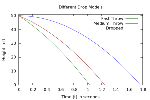
Think of xrange and yrange as a way to simply zoom into and out of a graph. We can also use them to zoom out:
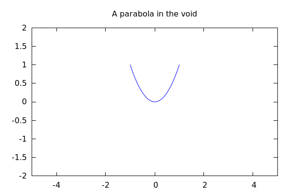
| --> |
wxdraw2d( title="A parabola in the void", explicit(x^2,x,-1,1), xrange=[-5,5], yrange=[-2,2]); |
3.2.4 Making the Graph Lines "Pop"
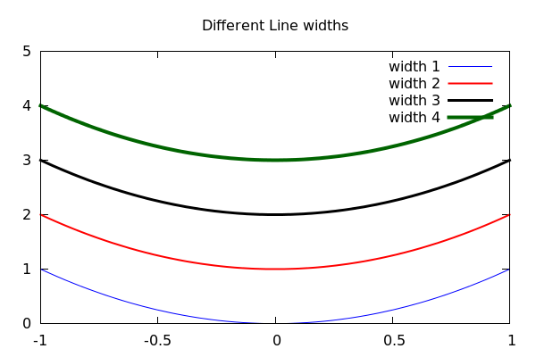
We can make the graph lines thicker (and therefore make them "pop") by using the line_width setting:
| --> |
wxdraw2d( title="Different Line widths", key="width 1",line_width=1, explicit(x^2,x,-1,1), key="width 2",line_width=2,color=red, explicit(x^2+1,x,-1,1), key="width 3",line_width=3,color=black, explicit(x^2+2,x,-1,1), key="width 4",line_width=4,color=dark_green, explicit(x^2+3,x,-1,1), yrange=[0,5]); |
3.2.5 Traditional xy-axes
You may have noticed a lack of x and y axes like you are used to. They are there, we just need to turn them
on using xaxis and yaxis options:
| --> |
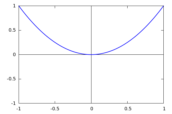
wxdraw2d( line_width=2, explicit(x^2,x,-1,1), yrange=[-1,1], xaxis=true,yaxis=true, xaxis_type=solid,yaxis_type=solid); |
So to get the axes, we first set them to true, and then set them to visible by assigning the types to be solid.
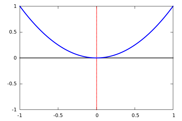
We could also set their widths, colors, as well as make them dotted:
| --> |
wxdraw2d( line_width=3, explicit(x^2,x,-1,1), yrange=[-1,1], xaxis=true,yaxis=true, xaxis_type=solid,yaxis_type=solid, xaxis_width=3,yaxis_width=4, xaxis_color=gray30,yaxis_color=red, yaxis_type=dots); |
3.2.6 Proportional Axes
Notice that the scale of the x and y axes don't really have much to do with one another in the previous examples. Maxima is simply presenting the graphs in a "pleasing" way. This can distort our impression of the graphs, and we can tell Maxima to
ensure that the x and y axes are at least proportionate using
proportional_axes=xy
Let's use an example where the discrepency between the x and y axes are very pronounced:
| --> |
wxdraw2d( proportional_axes=xy, title="Proportional axes", explicit(x^2,x,-1,1), explicit(x^2+1,x,-1,1), explicit(x^2+2,x,-1,1), explicit(x^2+3,x,-1,1), yrange=[0,5]); |
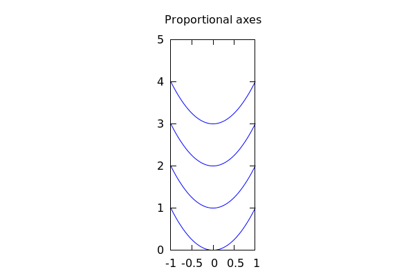
Now notice that the ratio between the height and the width for the above picture is 5:2 rather than 1 : 1.5.
This will be critical when dealing with circles or ellipses!
4 Implicit Graphs
To graph a function which is implicitly defined, like x^2+y^2=1, we simply swap the call to explicit() for a call to:
implicit(EQUATION,x,xmin,xmax,y,ymin,ymax)
It is important to keep in mind that your values for xmin, xmax, ymin, and ymax contain portions of the curve
that are *defined*.
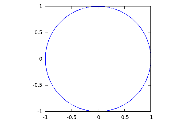
4.1 Examples
| --> |
wxdraw2d( proportional_axes=xy, implicit(x^2+y^2=1,x,-1,1,y,-1,1)); |
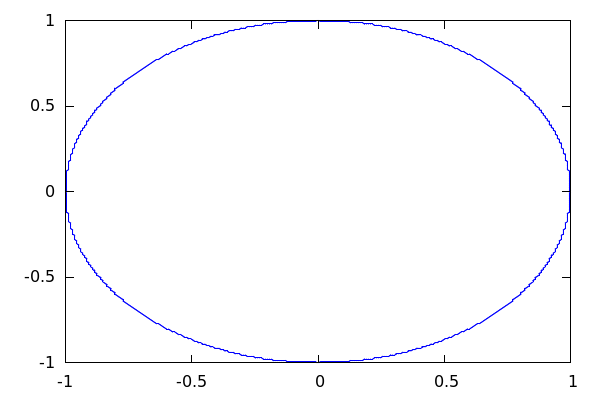
Note: without the proportional axes, the above graph would appear "squashed":
| --> | wxdraw2d(implicit(x^2+y^2=1,x,-1,1,y,-1,1)); |
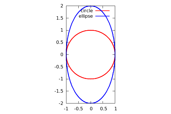
To illustrate why this is a problem, let's graph both an ellipse and a circle on the same set of axes *without* proportionality:
| --> |
wxdraw2d( implicit(x^2+y^2=1,x,-1,1,y,-1,1), implicit(x^2+y^2/4=1,x,-1,1,y,-2,2)); |
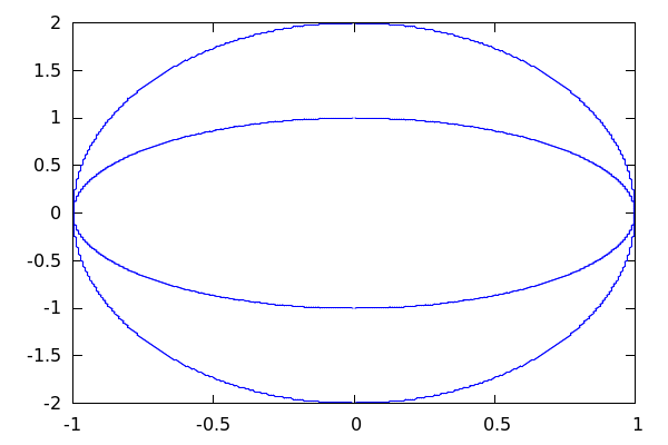
It is unclear that one of the above curves is a circle! Now with proportional axes and some stylistic flourishes:
| --> |
wxdraw2d( line_width=2, proportional_axes=xy, key="circle",color=red, implicit(x^2+y^2=1,x,-1,1,y,-1,1), key="ellipse",color=blue, implicit(x^2+y^2/4=1,x,-1,1,y,-2,2)); |
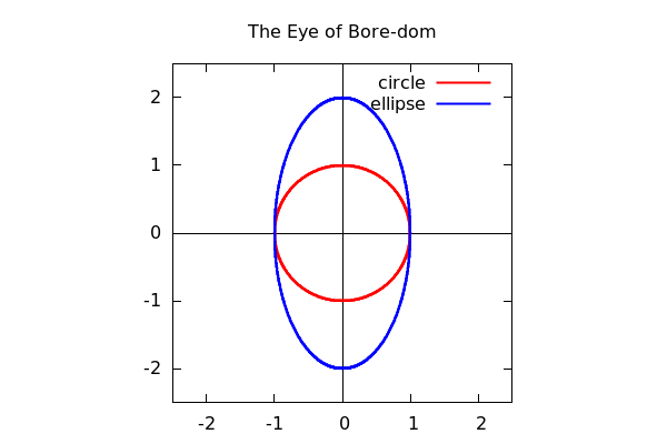
Notice that the above is "cramped", so we zoom out and add a set of axes:
| --> |
wxdraw2d( title="The Eye of Bore-dom", line_width=2, proportional_axes=xy, xrange=[-2.5,2.5],yrange=[-2.5,2.5], xaxis=true,yaxis=true,xaxis_type=solid,yaxis_type=solid, key="circle",color=red, implicit(x^2+y^2=1,x,-1,1,y,-1,1), key="ellipse",color=blue, implicit(x^2+y^2/4=1,x,-1,1,y,-2,2)); |
4.1.1 Should You Use Proportional Axes?
It depends. When working with conic sections, it's almost always advised that you do. But sometimes for ordinary functions, this can cause the graph to have such egregious dimensions, that it's just not worth it!
4.2 Mixing the Two Types of Functions
We can freely include both implicitly defined and explicitly defined functions within a draw2d command.
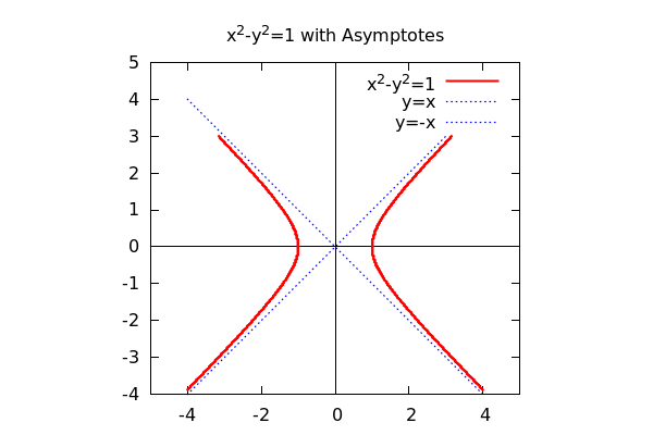
4.2.1 A Hyperbola with Asymptotes
| --> |
wxdraw2d( title="x^2-y^2=1 with Asymptotes", line_width=2, xaxis=true,yaxis=true,xaxis_type=solid,yaxis_type=solid, proportional_axes=xy, key="x^2-y^2=1",color=red, implicit(x^2-y^2=1,x,-4,4,y,-4,3), key="y=x",color=blue,line_type=dots, explicit(x,x,-4,3), key="y=-x", explicit(-x,x,-4,4), xrange=[-5,5],yrange=[-4,5] ); |
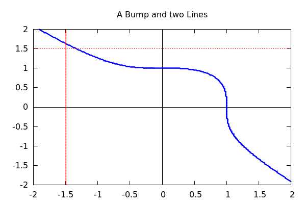
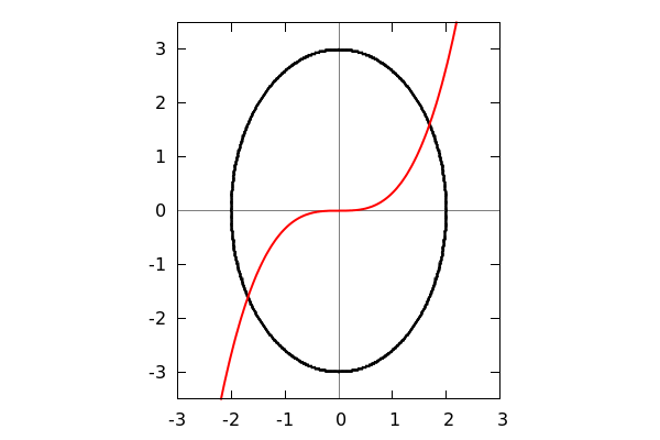
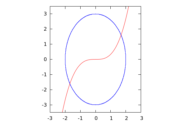
4.2.2 A Twist and a Line
| --> |
wxdraw2d( title="A Bump and two Lines", line_width=2, xaxis=true,yaxis=true,xaxis_type=solid,yaxis_type=solid, implicit(x^3+y^3=1,x,-2,2,y,-2,2), color=red,line_type=dots, explicit(1.5,x,-2,2), implicit(x=-1.5,x,-2,2,y,-2,2) ); |
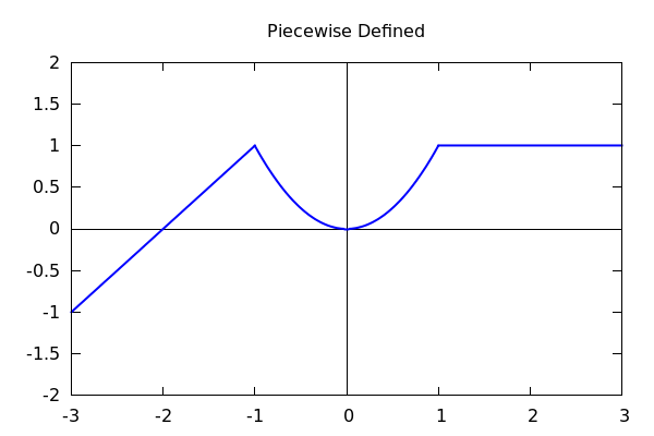
5 Piecewise Defined Functions
In this next example, we illustrate how we can "hack" the nature of the wxdraw2d() command to produce
the graph of a piecewise defined function.
| --> |
wxdraw2d( title="Piecewise Defined", yrange=[-2,2], line_width=2, xaxis=true,yaxis=true,xaxis_type=solid,yaxis_type=solid, explicit(x+2,x,-3,-1), explicit(x^2,x,-1,1), explicit(1,x,1,3)); |
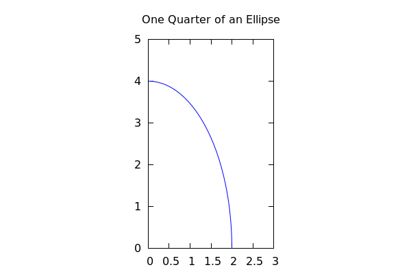
6 Ready Made Ellipses
It should be noted that wxdraw2d has a built-in function for drawing ellipses and circles
called:
ellipse(x-center,y-center,a,b,angle1,angle2)
where the center is (x-center,y-center), a and b determine the lengths of the semi-axes, with an
arc starting at angle1 degrees and cutting an arc of length angle2 degrees. So:
| --> |
wxdraw2d( title="One Quarter of an Ellipse", transparent=true, proportional_axes=xy, ellipse(0,0,2,4,0,90), xrange=[0,3],yrange=[0,5]); |
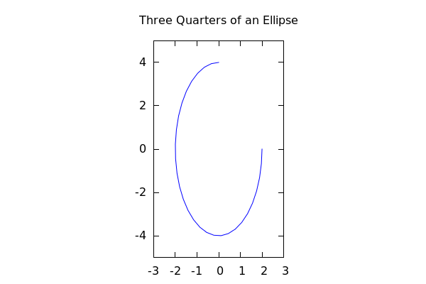
| --> |
wxdraw2d( title="Three Quarters of an Ellipse", transparent=true, proportional_axes=xy, ellipse(0,0,2,4,90,270), xrange=[-3,3],yrange=[-5,5]); |
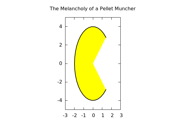
Note that if we do not specify "transparent=true", then the ellipse is plot as a solid:
| --> |
wxdraw2d( title="The Melancholy of a Pellet Muncher", proportional_axes=xy, fill_color=yellow, line_width=2,color=black, ellipse(0,0,2,4,45,270), xrange=[-3,3],yrange=[-5,5]); |
7 Asymptotes
A special note needs to be made about asymptotes.
| --> | wxdraw2d(explicit(1/x,x,-3,3)); |
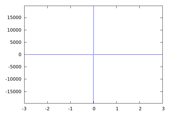
Notice the *extreme* scale of the graph here. That's because as x → 0 the graph shoots off to
either infinity. Let's zoom in to see what's happening around 0:
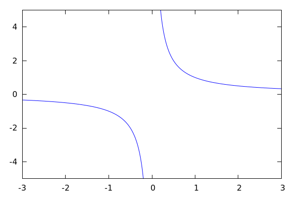
| --> |
wxdraw2d(explicit(1/x,x,-3,3), yrange=[-5,5] ); |
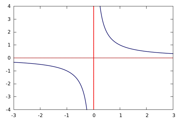
That's it! It's just the asymptote that we're seeing. So let's put in both the horizontal *and* vertical asymptote and
wrap up the graph:
| --> |
wxdraw2d( xaxis=true,yaxis=true,xaxis_type=solid,yaxis_type=solid, xaxis_width=1,yaxis_width=1, color=red, line_width=3,line_type=dots, explicit(0,x,-3,3), implicit(x=0,x,-3,3,y,-5,5), line_width=2,line_type=solid,color=midnight_blue, explicit(1/x,x,-3,3), yrange=[-4,4]); |
8 Labels and Points
8.1 Labels
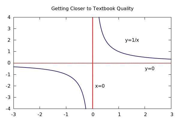
In the previous example, it would be nice if we could place a label on the asymptotes like we do in our hand drawings.
This is easily done with:
label(["labeltext",x,y])
where (x,y) is the center position for the label. We can control the alignment of the label with:
label_alignment=left (or center, or right)
Note that setting the alignment to left means that your text will be left justified *against* the point (x,y). Let's label those asymptotes!
| --> |
wxdraw2d( title="Getting Closer to Textbook Quality", xaxis=true,yaxis=true,xaxis_type=solid,yaxis_type=solid, xaxis_width=1,yaxis_width=1, color=red, line_width=3,line_type=dots, explicit(0,x,-3,3), implicit(x=0,x,-3,3,y,-5,5), line_width=2,line_type=solid,color=midnight_blue, explicit(1/x,x,-3,3), yrange=[-4,4], label_alignment=left,color=black, label(["x=0",.1,-2]), label(["y=0",2,-.5]), label(["y=1/x",1.25,2])); |
8.2 Points
Sometimes we just want to put down a point or two to indicate an intersection or a place of interest. draw2d has the command: points() that does this. It is built to take in a list of points so that you can put down all the points you need in one go:
points([ [x1,y1],[x2,y2],...,[xn,yn] ])
Note that even if you want to plot a single point, you must enter it as a list of a point like so:
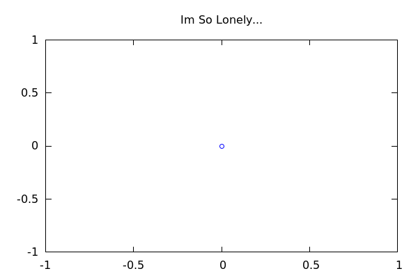
| --> |
wxdraw2d( title="Im So Lonely...", point_type=circle, points([[0,0]]), xrange=[-1,1], yrange=[-1,1]); |
| --> |
wxdraw2d( title="Im Not Lonely Anymore!", point_type=filled_circle, points([[-.75,.5],[0,0],[.5,.5],[.25,-.75]]), xrange=[-1,1], yrange=[-1,1]); |
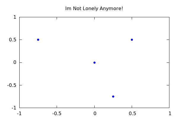
There are many types of point_type values that you can choose from. The default is +, which is pretty lousy. We suggest you opt for either circle or filled_circle.
9 Practical Examples of Plotting
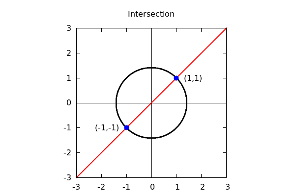
9.1 Example: Illustrating an Intersection
| (%i234) |
wxdraw2d( title="Intersection", proportional_axes=xy, xaxis=true,yaxis=true,xaxis_type=solid,yaxis_type=solid, line_width=2, color=black, implicit(x^2+y^2=2,x,-sqrt(2),sqrt(2),y,-sqrt(2),sqrt(2)), color=red, explicit(x,x,-3,3), color=blue,point_type=filled_circle,point_size=1.5, points([[1,1],[-1,-1]]), color=black, label_alignment=left, label(["(1,1)",1.3,1]), label_alignment=right, label(["(-1,-1)",-1.3,-1]), xrange=[-3,3],yrange=[-3,3] ); |
9.2 Example: Graphing Parts of an Equation
Recall that we can assign an equation to a letter, and we can pull out either side using rhs() or lhs().
This can be useful for visually understanding where a solution may lie:
| --> | E:x^2 -4*x = 5*x^5 + 3*x^2 + 7; |
| --> |
wxdraw2d( line_width=2, color=blue,key="RHS", explicit(rhs(E),x,-5,5), color=red,key="LHS", explicit(lhs(E),x,-5,5), yrange=[-20,20], xaxis=true,yaxis=true,xaxis_type=dots,yaxis_type=dots, title="x^2-4x=5x^5+3x^2+7", point_type=circle,color=black,point_size=4, key="", points([[-1,5]]), label_alignment=right, label(["Intersection -->",-1.5,5]) ); |
Solving shows that we do indeed get a single solution somewhere around -1:
| --> | S:solve(E); |
Do you see it there at the very end?
| --> | S[5]; |
The other solutions were complex. We can verify this by looking at their imaginary parts like so:
| --> | imagpart(float(rhs(S[1]))); |
10 Conveniences -- Using makelist() and set_draw_defaults()
10.1 set_draw_defaults()
As you may have noticed, it can be a little cumbersome to include the x and y axes *every* time you want to graph a function. Maxima provides a way to set the default behavior of graphs so that every graph automatically starts with certain settings enabled. It is called, shockingly, set_draw_defaults(). And it is used as follows:
By calling the following command, every graph that we plot afterwards will have visible (and gray) x and y axes, lines automatically set to width 2, curves and points that default to black, and points that are solid circles.
| (%i7) |
set_draw_defaults( xaxis=true, yaxis=true, xaxis_type=solid, yaxis_type=solid, xaxis_color=gray50, yaxis_color=gray50, line_width=2, color=black, point_type=filled_circle ); |
Now for a few examples:
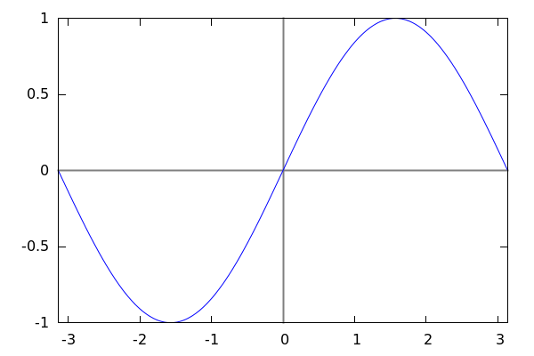
| (%i11) |
wxdraw2d( title="sin(x) at %pi/4, 0, and -3%pi/4", explicit(sin(x),x,-2*%pi,2*%pi), points([[0,0],[%pi/4,1/sqrt(2)], [-3*%pi/4,-1/sqrt(2)]]) ); |
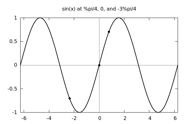
See how much cleaner the defaults above make the process of plotting. Let's do another:
| (%i17) |
wxdraw2d( implicit(x^2/4+y^2/9=1,x,-2,2,y,-3,3), color=red, explicit(1/3*x^3,x,-3,3), proportional_axes=xy, xrange=[-3,3],yrange=[-3.5,3.5] ); |
Notice how the defaults are overriden when a new value is assigned to color.
10.2 Reseting Defaults
If you want to get rid of the default style that you have set, you can simply call:
| (%i19) | set_draw_defaults(); |
with no parameters. This resets all behavior to stock. To compare, let's look at the last example now:
| (%i20) |
wxdraw2d( implicit(x^2/4+y^2/9=1,x,-2,2,y,-3,3), color=red, explicit(1/3*x^3,x,-3,3), proportional_axes=xy, xrange=[-3,3],yrange=[-3.5,3.5] ); |
Notice the lack of gray axes, the blue color of the ellipse, and the thin lines of the curves!
10.3 Binding Axes Options to a List
What if we want to put axes in our graphs *sometimes* but other times not? We could use set_draw_defaults()
to build the axes for us, but then every time we reset the defaults, we would have to code them again. Here is
where lists make things much better!
We will bind the axes settings to a variable, and simply toss that variable into the wxdraw2d() command when we need it!
| --> |
myaxes:[xaxis=true, yaxis=true, xaxis_type=solid, yaxis_type=solid, xaxis_color=gray50, yaxis_color=gray50, xaxis_width=2, yaxis_width=2]; |
Now we can use this by simply adding in myaxes as an option to the plot command like so:
| (%i235) |
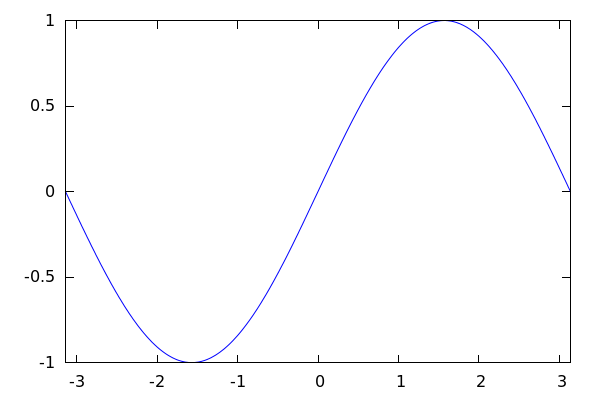
wxdraw2d( myaxes, explicit(sin(x),x,-%pi,%pi)); |
Now, if you don't want the axes in your next plot, simply do not include the myaxes list in the draw command and voila --
axes gone!
| (%i236) | wxdraw2d(explicit(sin(x),x,-%pi,%pi)); |
11 Advanced Techniques
11.1 Advanced tool: makelist()
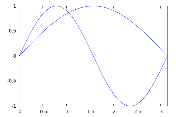
wxdraw2d() and draw2d() can actually take lists of curves to plot. So for instance:
| --> |
wxdraw2d( [explicit(sin(x),x,0,%pi),explicit(sin(2*x),x,0,%pi)] ); |
Ok, so this doesn't really look all that useful on first glance, but this can actually be incredibly powerful when paired with
Maxima's command: makelist(). This command has the ability to automatically build a list based off of parameters. The syntax is:
makelist(object(parameter), parameter, parameter_start,parameter_stop,parameter_step)
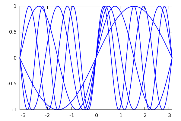
If you omit parameter_step then it defaults to steps of length 1. Let's illustrate how useful this can be in simplifying output as well as building large families of curves:
| (%i29) |
sinecurves:makelist(explicit(sin(k*x),x,-%pi,%pi),k,1,5); |
Each entry in sinecurves gives us a new curve that we can plot.
| (%i32) | sinecurves[1];sinecurves[2]; |
And since wxdraw2d() can plot an entire list, we can simply do:
| (%i33) |
wxdraw2d( line_width=2, sinecurves); |
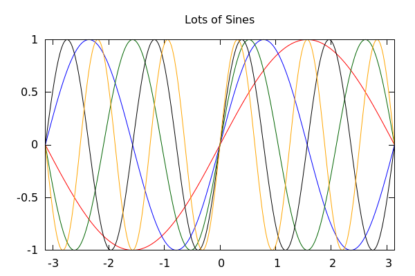
In fact, wxdraw2d() and draw2d() can block any of its input into lists, which means that we can alter colors and set keys
at the same time!
Note: The command join() "zips" two lists together. If L and M are lists, then join(L,M) = [L[1],M[1],L[2],M[2],...]
| (%i81) |
sinecolors:[red,blue,dark_green,black,orange]; colorkeys:makelist(color=sinecolors[k],k,1,5); |
| (%i84) | fancysinecurves:join(colorkeys,sinecurves); |
| (%i85) | wxdraw2d(title="Lots of Sines", fancysinecurves); |
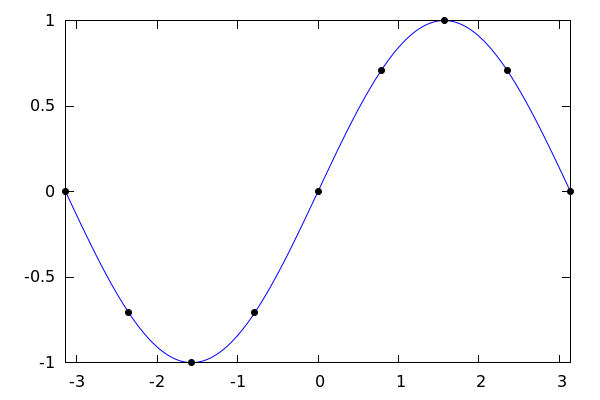
Here's another example, where we plot a sine curve and then all of the points that are %pi/4 apart are placed onto the graph:
| (%i86) | allthepoints:makelist([k*%pi/4,sin(k*%pi/4)],k,-4,4); |
| (%i91) |
wxdraw2d(explicit(sin(x),x,-%pi,%pi), point_type=filled_circle, color=black,points(allthepoints)); |
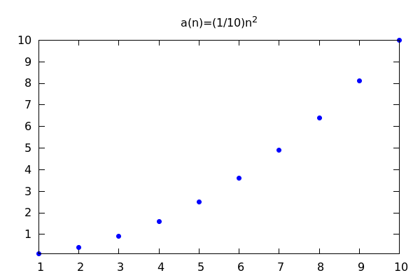
11.2 Advanced: Using makelist() to Generate Sequence Graphs
We can actually use makelist() and points() to graph sequences:
| (%i238) |
a(n):=(1/10)*n^2; allthepoints:makelist([k,a(k)],k,1,10); |
| (%i239) | wxdraw2d(point_type=filled_circle,points(allthepoints), title="a(n)=(1/10)n^2"); |
| (%i242) |
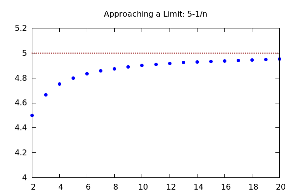
b(n):=5-1/n$ allthepoints:makelist([k,b(k)],k,2,20)$ wxdraw2d(point_type=filled_circle,points(allthepoints), line_type=dots, line_width=3, color=dark_red, explicit(5,x,2,20), yrange=[4,5.2], title="Approaching a Limit: 5-1/n"); |
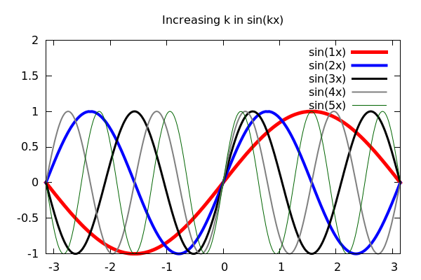
11.3 Advanced Technique: Using makelist(),join(), and flatten() to Auto-build Options
The final example that we will use makes use of the list command flatten() that takes a list of lists and dumps everything into one list like so:
| (%i139) | flatten([[1,2],[2,3],[[2],[4,5]]]); |
While this topic is slightly out of the scope of an introduction, if you go on to use Maxima to plot large amounts of information, the wxdraw2d() commands flexibility together with makelist(), join() and flatten() make an incredibly powerful trio as the next example illustrates:
| (%i198) |
sinecolors:[red,blue,black,gray50,dark_green]$ sineoptions:makelist([color=sinecolors[k],line_width=6-k,key=concat("sin(",string(k),"x)")],k,1,5)$ sinecurves:makelist(explicit(sin(k*x),x,-%pi,%pi),k,1,5)$ mygraph:flatten(join(sineoptions,sinecurves)); |
| (%i199) |
wxdraw2d( title="Increasing k in sin(kx)", mygraph, yrange=[-1,2]); |
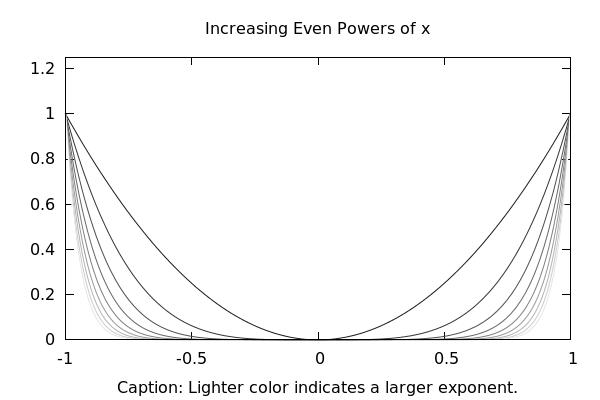
Let's see this idea again, with even powers of x^k, where larger powers get lighter on the graph:
| (%i225) |
bowlcolors:makelist(color=concat("gray",string(10*k)),k,1,10)$ bowls:makelist(explicit(x^(2*k),x,-1,1),k,1,10)$ mygraph:flatten(join(bowlcolors,bowls)); |
| (%i228) |
wxdraw2d(mygraph, title="Increasing Even Powers of x", xlabel="Caption: Lighter color indicates a larger exponent.", yrange=[0,1.25]); |
12 Saving Just the Picture
As a final word about graphing, we note that if you right click on the pictures that you produce
you will get two options: Copy, and Save Image. If you select Copy, then it will copy the picture to the
clipboard so that you can paste it into another document - say a Word document.
If you select Save Image, then you can save it as either a PNG or JPG file to use later.