Direction Fields
In this section, we will cover how to use Maxima to draw direction fields for differential equations of the form:
dy/dx = F(x,y)
In order to do this, we must pull in a package called "drawdf." We do this with the following command:
| --> | load("drawdf")$ |
This package also pulls in a library called draw that will allow us to not only plot direction fields, but also curves, points, etc.
1 Basic Usage
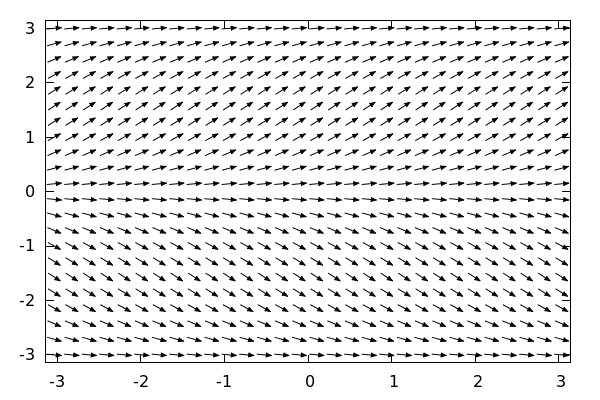
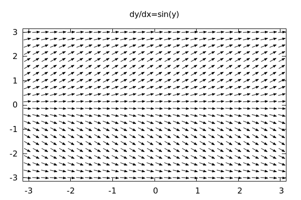
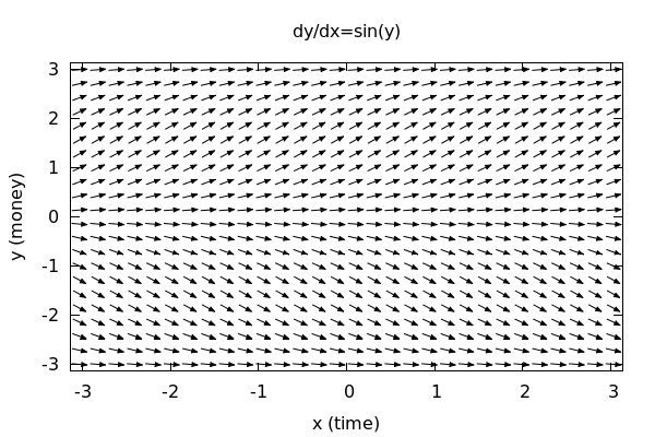
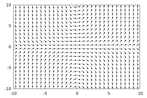
Let's say that I want to give a quick plot of a direction field given by: dy/dx = sin(y). The syntax is:
| --> | wxdrawdf(sin(y)); |

Pretty simple, and suprisingly effective. Note that the ranges for x and y will automatically be set to -10 to 10.
To alter this we simply adjust the command to include the ranges we require for the plot:
| --> |
wxdrawdf(sin(y), [x,-%pi,%pi], [y,-%pi,%pi]); |
Note: there is another way to alter the range of a plot within a draw environment: namely xrange=[xmin,xmax] and yrange=[ymin,ymax]. These will change the range of the plot, but it has the effect of "zooming in" on the field, so that
there will be less arrows in the region. To see the difference:
| --> |
wxdrawdf(sin(y), xrange=[-%pi,%pi], yrange=[-%pi,%pi]); |
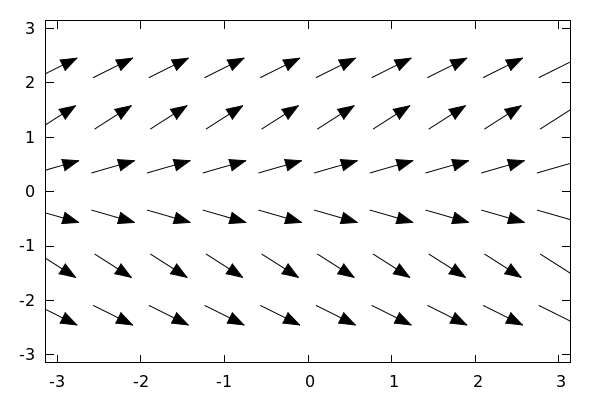
This is effectively the same plot as the very first example, except we have focused only
on the rectangle [-%pi,%pi]x[-%pi,pi]. This really isn't the behavior we are looking for here,
so we will use the [x,xmin,xmax] and [y,ymin,ymax] syntax to ensure that our fields have
"enough" vectors to give a strong sense of direction no matter the scale.
2 Titles and Styling
2.1 Titles, Axes Labels, and Variables
To add a title we add in the command: title="dy/dx=sin(y)" anywhere *after* the sin(y) in the wxdrawdf() command.
Like so:
| --> |
wxdrawdf(sin(y), [x,-%pi,%pi],[y,-%pi,%pi], title="dy/dx=sin(y)"); |
To add labels to the x and y axes we use:
| --> |
wxdrawdf(sin(y), [x,-%pi,%pi],[y,-%pi,%pi], title="dy/dx=sin(y)", xlabel="x (time)", ylabel="y (money)"); |
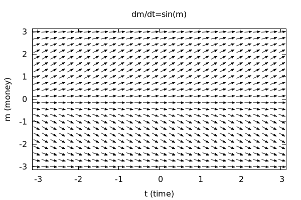
Since the variables involved are time and money, it makes more sense to use t and m in the commands. So let's do that:
| --> |
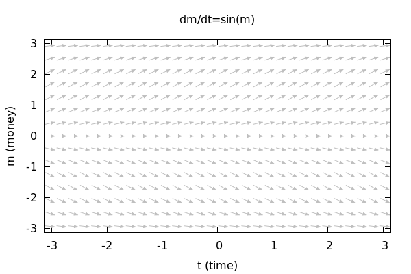
wxdrawdf(sin(m), [t,-%pi,%pi],[m,-%pi,%pi], title="dm/dt=sin(m)", xlabel="t (time)", ylabel="m (money)"); |
2.2 Altering the Number of Arrows
We can change the number of arrows by altering a setting called: field_grid which is responsible for carving the
axes into a grid and computing an arrow at each grid point. Typing field_grid=[cols,rows] will divide the axes into
a grid of cols many columns and rows many rows. So:
| --> |
wxdrawdf(sin(m), [t,-%pi,%pi],[m,-%pi,%pi], field_grid=[20,20], title="dm/dt=sin(m)", xlabel="t (time)", ylabel="m (money)"); |
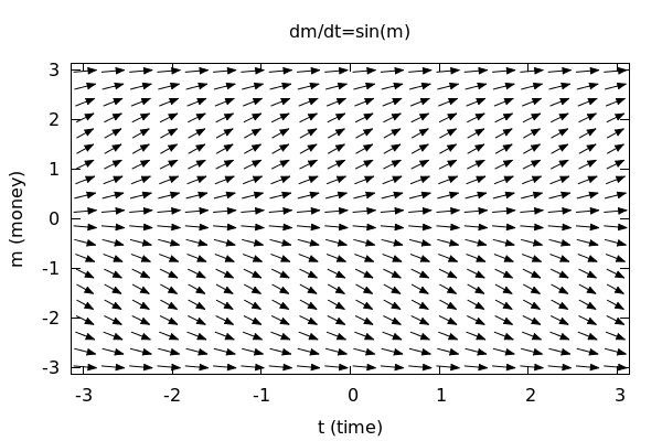
A quick count above shows that each row has 20 arrows and so does each column. Let's up the number of arrows here:
| --> |
wxdrawdf(sin(m), [t,-%pi,%pi],[m,-%pi,%pi], field_grid=[50,50], title="dm/dt=sin(m)", xlabel="t (time)", ylabel="m (money)"); |
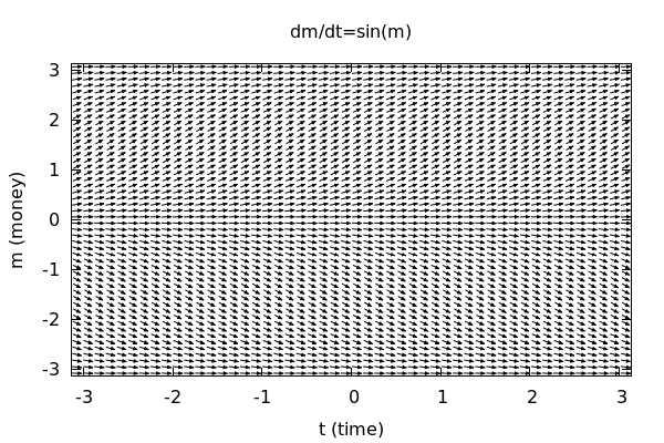
BE CAREFUL! Upping the grid too much will not only crowd the field making it virtually unreadable, but
it can also significantly slow down computation time! A good grid size is 25x25. 40x40 can be used if you
want a *really* dense depiction of the field.
There is no reason for the number of rows and columns to be equal! It is perfectly reasonable to have something like:
| --> |
wxdrawdf(sin(m), [t,-%pi,%pi],[m,-%pi,%pi], field_grid=[30,15], title="dm/dt=sin(m)", xlabel="t (time)", ylabel="m (money)"); |

2.3 Field Color and Proportional Axes
Let's say that we want to change the color of our arrows to something a little lighter so that
we have an easier time drawing on top of the field after we've printed it out. We can change the field color with (wait for it ... )
field_color:
| --> |
wxdrawdf(sin(m), [t,-%pi,%pi],[m,-%pi,%pi], field_grid=[30,15], field_color=gray, title="dm/dt=sin(m)", xlabel="t (time)", ylabel="m (money)"); |
There is a huge list of colors that are available: gray,gray0,gray10,...,gray100, black, red, dark_red, medium_red,light_red, blue, light_blue, pink, brown,orange, plum, and the list goes on. I would suggest experimenting. The official list of supported colors can be found in the draw library official documentation for Maxima.
Note also that Maxima's default behavior is to produce a plot that roughly follows the golden ratio in terms of its proportions.
This is to be aesthetically pleasing. But if we note above that the ranges for both x and y are the same, this could be responsible for distorting our understanding of the field. We can fix that with the command:
proportional_axes=xy
| --> |
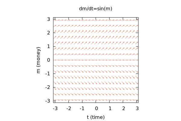
wxdrawdf(sin(m), [t,-%pi,%pi],[m,-%pi,%pi], field_grid=[25,15], field_color=dark_salmon, /*Something's nefariously fishy about this color choice...*/ proportional_axes=xy, title="dm/dt=sin(m)", xlabel="t (time)", ylabel="m (money)"); |
3 Adding and Styling Integral Curves (Solution Curves)
Adding in a solution curve is really simple. wxdrawdf() has two options for us to use here:
soln_at(x,y)
solns_at([x1,y1],[x2,y2],...,[xn,yn])
The first command obviously puts in a solution passing through the point (x,y), while the second
command adds in the *solutions* passing through the given points.
| --> |
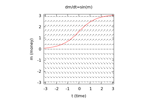
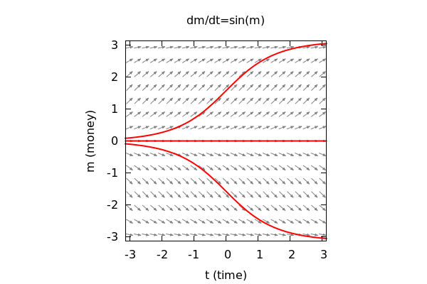
wxdrawdf(sin(m), [t,-%pi,%pi],[m,-%pi,%pi], field_grid=[25,15], field_color=gray50, /*One of the fifty shades no doubt...*/ proportional_axes=xy, title="dm/dt=sin(m)", xlabel="t (time)", ylabel="m (money)", soln_at(0,%pi/2)); |
Let's add in two more solution curves. We could do this one after another using soln_at() or we could do them all in one go with:
| --> |
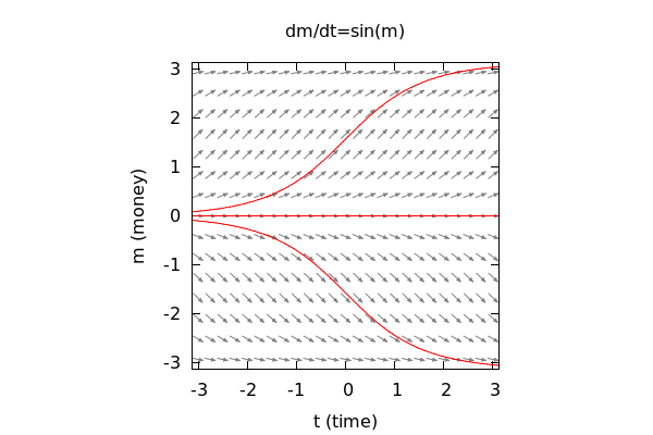
wxdrawdf(sin(m), [t,-%pi,%pi],[m,-%pi,%pi], field_grid=[25,15], field_color=gray50, /*One of the fifty shades no doubt...*/ proportional_axes=xy, title="dm/dt=sin(m)", xlabel="t (time)", ylabel="m (money)", solns_at([0,%pi/2],[0,0],[0,-%pi/2]) ); |
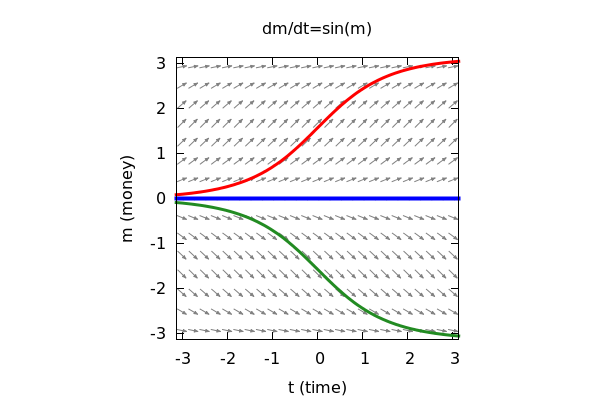
3.1 Making the Solution Lines "Pop"
The above graph is certainly adequate, but it suffers from the solution lines not really standing out. We
can easily remedy this by changing their thickness to "pop" out of the diagram. We do this by setting line_width to a
small integer larger than 1 (2, 3, or 4 will do, 5 or more starts to look silly):
| --> |
wxdrawdf(sin(m), [t,-%pi,%pi],[m,-%pi,%pi], field_grid=[25,15], field_color=gray50, /*One of the fifty shades no doubt...*/ proportional_axes=xy, title="dm/dt=sin(m)", xlabel="t (time)", ylabel="m (money)", line_width=2, solns_at([0,%pi/2],[0,0],[0,-%pi/2]) ); |
Note that the line_width=2 must come before the curve you want it to apply to. We can
actually alter the color and widths of each solution curve individually if that is important to us:
| --> |
wxdrawdf(sin(m), [t,-%pi,%pi],[m,-%pi,%pi], field_grid=[25,15], field_color=gray50, /*One of the fifty shades no doubt...*/ proportional_axes=xy, title="dm/dt=sin(m)", xlabel="t (time)", ylabel="m (money)", line_width=3, color=red, soln_at(0,%pi/2), line_width=4, color=blue, soln_at(0,0), line_width=3, color=forest_green, soln_at(0,-%pi/2) ); |
3.2 Adding Points and Labels
3.2.1 Points
Finally, suppose that we want to show our readers just which initial values were used to generate
the solution curves that we have represented in our graph. We can easily add points using the commands:
point_at(x,y)
points_at([x1,y1],...,[xn,yn])
CAUTION! These functions only exist in the drawdf library and not in the draw library by itself! So if you try to use point_at() or points_at() without loading drawdf -- they will not work!
Whether you add points one at a time or all at once depends on whether or not you want to style them individually!
Let's just add all three points at once:
| --> |
wxdrawdf(sin(m), [t,-%pi,%pi],[m,-%pi,%pi], field_grid=[25,15], field_color=gray50, /*One of the fifty shades no doubt...*/ proportional_axes=xy, title="dm/dt=sin(m)", xlabel="t (time)", ylabel="m (money)", line_width=3, color=red, soln_at(0,%pi/2), line_width=4, color=blue, soln_at(0,0), line_width=3, color=forest_green, soln_at(0,-%pi/2), color=black, points_at([0,%pi/2],[0,0],[0,-%pi/2]) ); |
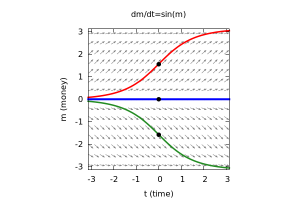
Note that we added the points *after* we plotted the solutions. This was force the point *on top* of the solution curve visually. Had we added the points first -- which we could have done, this would have given the impression that the curves were cutting through the points.
3.2.2 Adding Labels
Now for the last step. We would like to label each point with its coordinates on the graph. We do this with the command: label() and the syntax is:
label(["label text",x,y])
Here (x,y) is the location that you would like to label with the "label text." Do note that this will place the text dead center on
the point (x,y), so we need to offset it a little bit so as to not cover the object we want to emphasize.
We can further help the situation by setting a variable called
label_alignment
so that the default behavior is not to plop the label right in the middle of our point. The available values are:
left, center, right
Setting label_alignment=left means that the label will now be left justified against the object. Setting label_alignment=right, right justifies the label agains the object. The default setting is of course, center.
| --> |
wxdrawdf(sin(m), [t,-%pi,%pi],[m,-%pi,%pi], field_grid=[25,15], field_color=gray50, /*One of the fifty shades no doubt...*/ proportional_axes=xy, title="dm/dt=sin(m)", xlabel="t (time)", ylabel="m (money)", line_width=3, color=red, soln_at(0,%pi/2), line_width=4, color=blue, soln_at(0,0), line_width=3, color=forest_green, soln_at(0,-%pi/2), color=black, points_at([0,%pi/2],[0,0],[0,-%pi/2]), label_alignment=left, label(["(0,PI/2)",.1,%pi/2]), label(["(0,0)",.1,-.3]), label_alignment=right, label(["(0,-PI/2)",-.1,-%pi/2-.2]) ); |
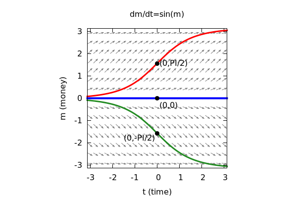
Placing labels in diagrams is much more an art than it is a science. Don't be suprised if it takes a little bit of jiggering about to find the right placement of your text.
4 Parting Thoughts on Styling
If you look at the last example, it might be a little overwhelming. You are not expected to do this for *every single plot* that you make. The above example is really intended to illustrate the tools that you have available to you to make high quality graphical representations of direction fields. Depending on the purpose of your graph, it may or may not be necessary to pull out all the stops!
When graphing, you should always start with the defaults without *any* decorations. Then slowly add in extra styling as you see fit and necessary!
5 Several Examples
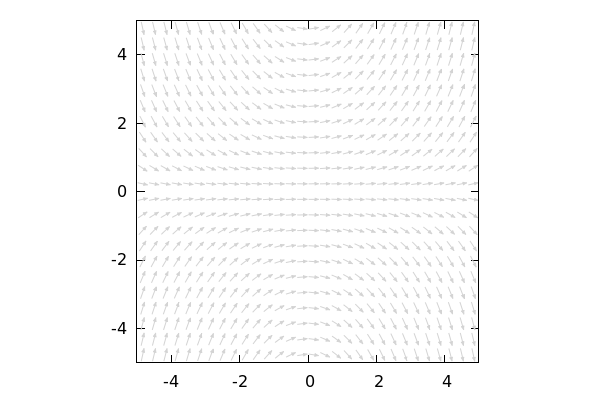
5.1 dy/dx=0.2xy
5.1.1 Defaults:
| --> | wxdrawdf(0.2*x*y); |
5.1.2 For Printing and Drawing On:
| --> |
wxdrawdf(0.2*x*y, [x,-5,5],[y,-5,5], field_color=light_gray, proportional_axes=xy); |
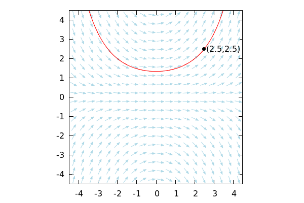
5.1.3 Fancier, with a Solution Curve through (2.5,2.5)
| --> |
wxdrawdf( 0.2*x*y, [x,-4.5,4.5],[y,-4.5,4.5], field_grid=[20,20], field_color=light_blue, proportional_axes=xy, soln_at(2.5,2.5), color=black, point_at(2.5,2.5), label_alignment=left, label(["(2.5,2.5)",2.6,2.5]) ); |
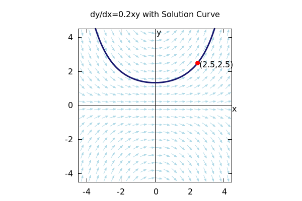
5.1.4 Fanciest, with Solution Curve through (2.5,2.5) and Axes:
This last field is just about text-book quality:
| --> |
wxdrawdf( 0.2*x*y, [x,-4.5,4.5],[y,-4.5,4.5], field_grid=[20,20], field_color=light_blue, proportional_axes=xy, color=black, xaxis=true,xaxis_type=solid, /*Put in xy-axes*/ yaxis=true,yaxis_type=solid, color=midnight_blue, line_width=3, soln_at(2.5,2.5), color=red, point_at(2.5,2.5), color=black, label_alignment=left, label(["(2.5,2.5)",2.6,2.4]), xtics=2,ytics=2, label(["x",4.5,-.2]), label(["y",.1,4.3]), title="dy/dx=0.2xy with Solution Curve" ); |
6 Plotting On Top of A Direction Field
Sometimes we (for whatever reason) want to be able to compare a solution curve through a direction field with a known
function visually. This can be done using the explicit() and implicit() graphing functions. Their syntax is as follows:
explicit(f(x),x,xmin, xmax)
implicit(Equation in x and y, x, xmin,xmax,y,ymin,ymax)
6.1 Examples
6.1.1 dy/dx=-y/x
Let's say we plot the direction field for dy/dx=-y/x along with a solution through (5,5):
| --> | wxdrawdf(-y/x, line_width=2, soln_at(5,5)); |
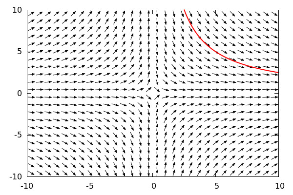
We have a sneaking suspicion that this curve is similar within the range shown to the graph of y = 5/x,
and we'd just like to compare the two. So, let's put y=25/x into the picture too:
| --> |
wxdrawdf(-y/x, field_color=light_gray, line_width=2, key="Solution", soln_at(5,5), color=blue, key="25/x", explicit(25/x,x,1,10)); |
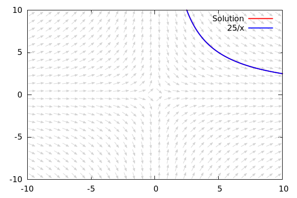
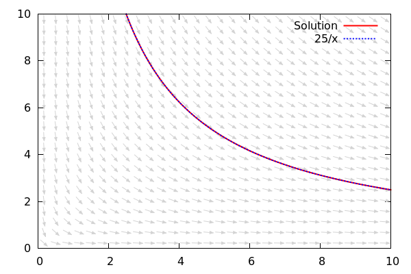
By seeing them next to each other on the graph, we clearly see that these are the exact same curves!
To really see the two curves pop out, let's dot the 25/x curve:
| --> |
wxdrawdf(-y/x, [x,0,10],[y,0,10], field_color=light_gray, line_width=2, key="Solution", soln_at(5,5), color=blue, key="25/x", line_type=dots, line_width=3, explicit(25/x,x,1,10)); |
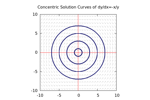
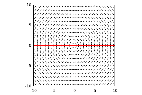
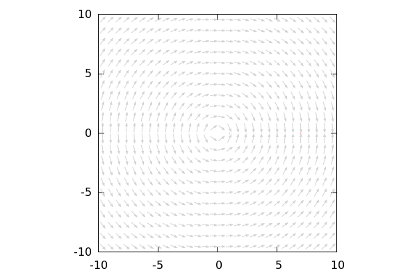
6.1.2 dy/dx=-x/y
| --> |
wxdrawdf(-x/y, xaxis_color=red,yaxis_color=red, xaxis=true,xaxis_type=solid, yaxis=true,yaxis_type=solid, proportional_axes=xy); |
We recognize this differential equation as arising from implicitly differntiating x^2+y^2=r^2,
and we know that the solution curves here are concentric circles, but because of the 0 in the denominator of dy/dx, any attempt to use solns_at with initial values (x,0) will fail:
| --> |
wxdrawdf(-x/y, field_color=light_gray, proportional_axes=xy, solns_at([1,0],[5,0],[7,0])); |
So we will put them in manually:
| --> |
wxdrawdf(-x/y, field_color=light_gray, proportional_axes=xy, line_width=2, xaxis=true,xaxis_type=solid,xaxis_color=red, yaxis=true,yaxis_type=solid,yaxis_color=red, color=midnight_blue, implicit(x^2+y^2=1,x,-1,1,y,-1,1), implicit(x^2+y^2=9,x,-3,3,y,-3,3), implicit(x^2+y^2=25,x,-5,5,y,-5,5), implicit(x^2+y^2=49,x,-7,7,y,-7,7), title="Concentric Solution Curves of dy/dx=-x/y" ); |